Make more money selling training online: TrainHeroic Marketplace PageBuilder 3.0
Coach Development | UnlistedCal Strength leveraged this optimized page design to increase their online training sales conversions by 38%.
Now you can use it too.
Meet Marketplace PageBuilder 3.0, our most recent enhancement to the TrainHeroic Marketplace.
3.0 is a new product listing template we designed to drive killer conversion rates for coaches selling their training online.
// selling training online just got a whole lot easier
The vision for 3.0 was simple: Make coaches look pro, with less effort, by delivering an easy-to-use sales page builder.
No coding.
No wrangling hard-to-manage contractors.
And no need to retain a graphic designer on your payroll.
Just clean, compelling listing pages any coach can design, update, and manage themselves.
As much as it may dishearten your well-intentioned mama, people do judge a book by its cover. So if you’re trying to sell your training online, a professional presentation of your offerings is critical to your success.
As Daniel Kahneman famously asserted in “Thinking Fast and Slow,” humans are cognitively lazy. We use simple, reductive signals to make quick decisions in an increasingly complex information landscape.
Your buyers are only human. They buy based on emotion (fast), then rationalize their decisions using logic (slow) so they feel smart and self-satisfied. Knowing this, our team leaned into the natural decision-making process of your prospective buyers as we designed these new listing pages.
The TrainHeroic Marketplace PageBuilder 3.0 template is optimized to excite your audience, then turn that excitement into buying action. Its vertical flow first sells to emotion, then down the page, works to back up that emotional resonance with strong appeals to logic.
To bring it all together, our team adhered to three simple principles in the design process:
1. Maximize Personalization and Branding
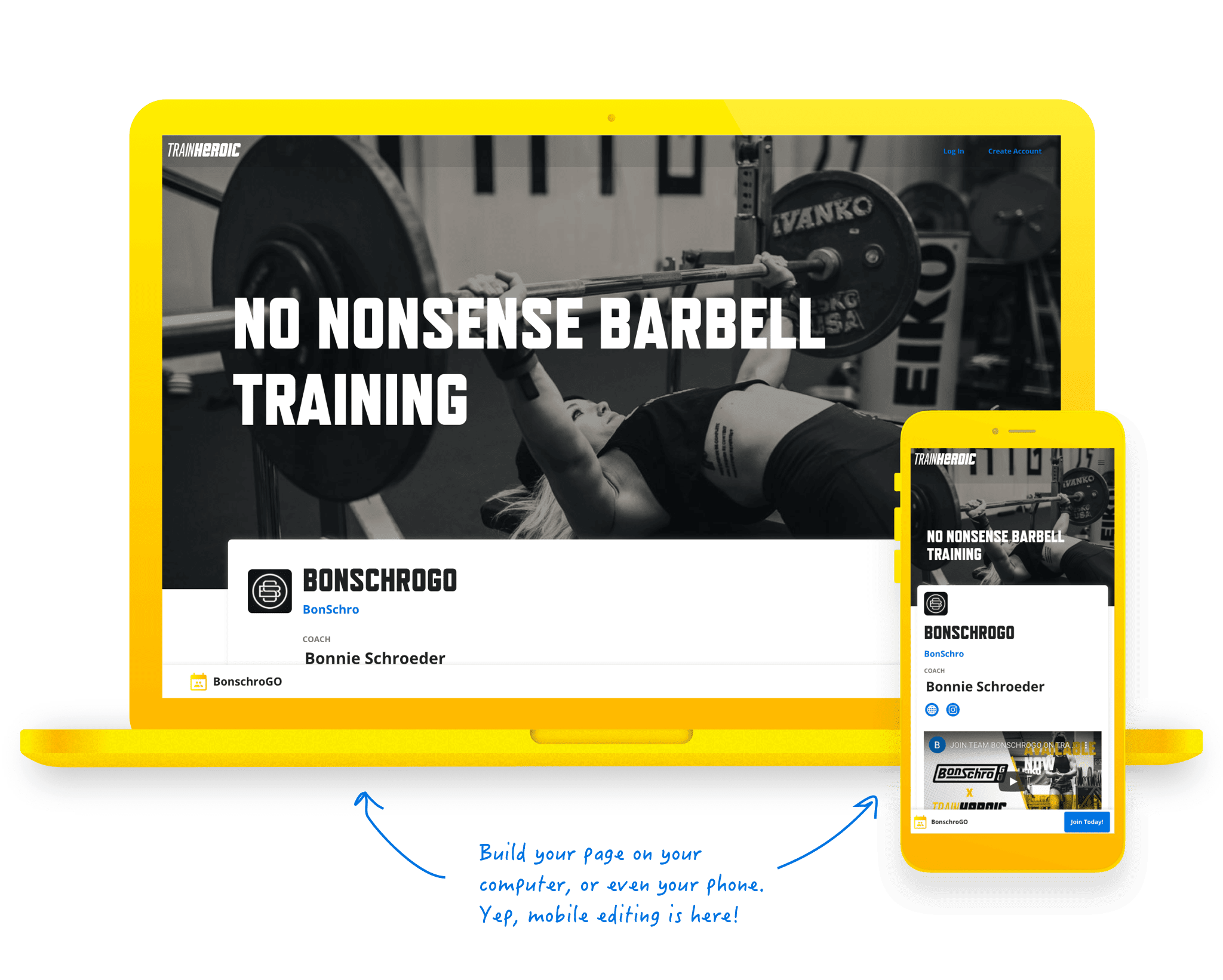
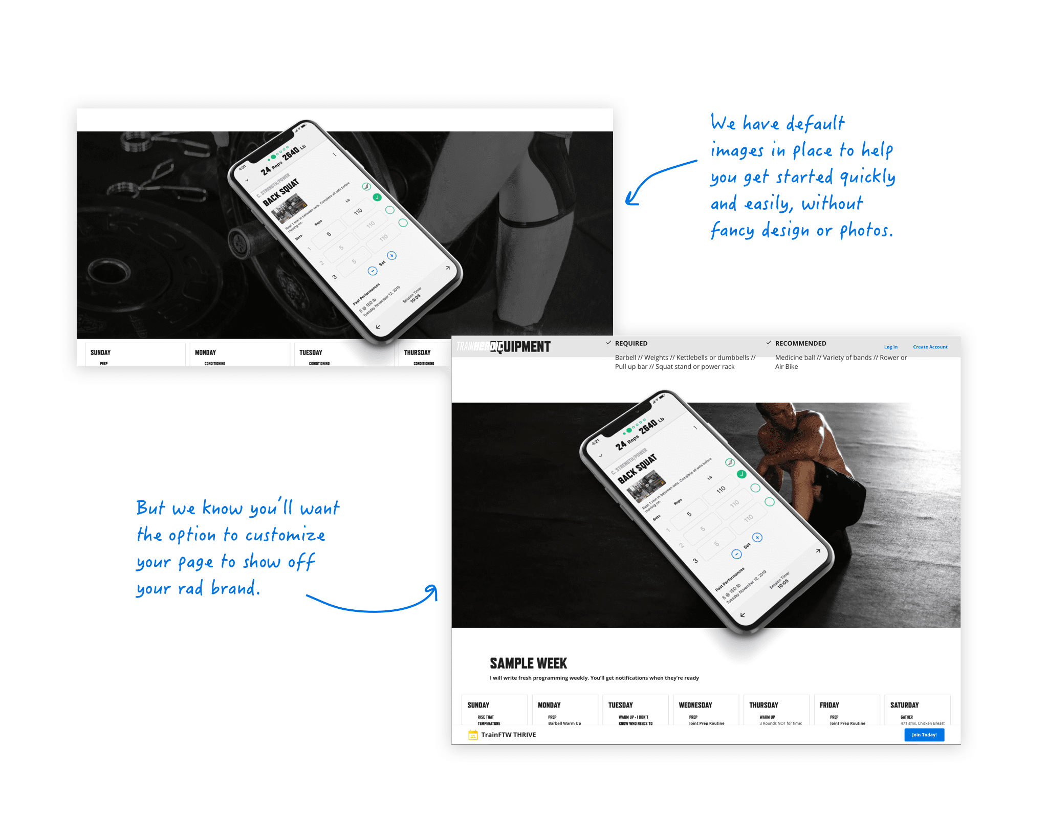
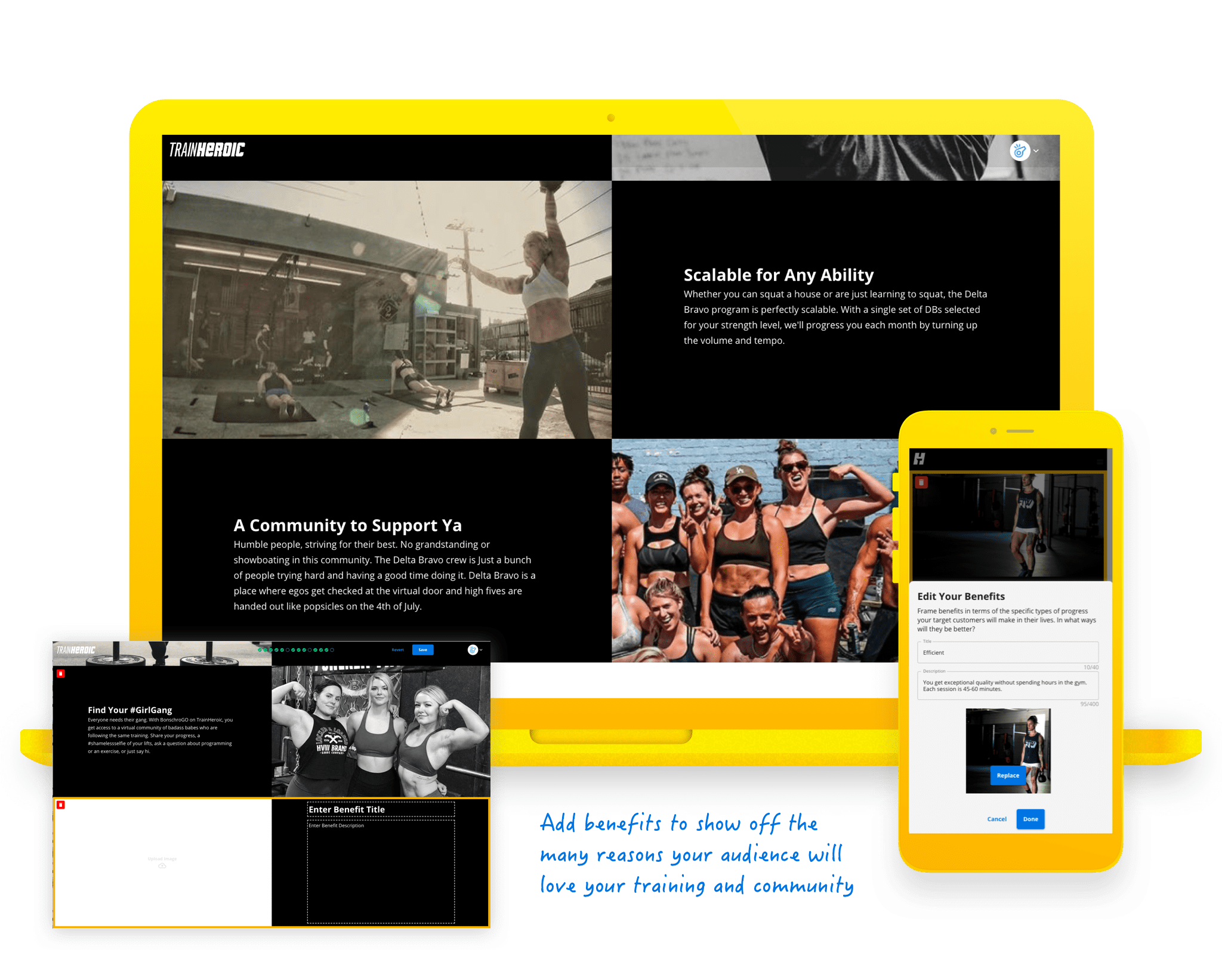
Our animal brains are drawn to bright colors. So with the updated design, we wanted to amp up the number of visual branding opportunities at your disposal. Now, you can add pictures to grab your buyer’s attention, reinforce your benefits, showcase your product, and humanize your digital offering. We also introduced an option to overlay a tagline atop your header imagery to quickly communicate your value proposition and help you stand out.
2. Make it Easy for Coaches to Execute
Most of our sellers are small business owners and solopreneurs, not designers. So we wanted to deliver a winning solution anyone could use without technical expertise.
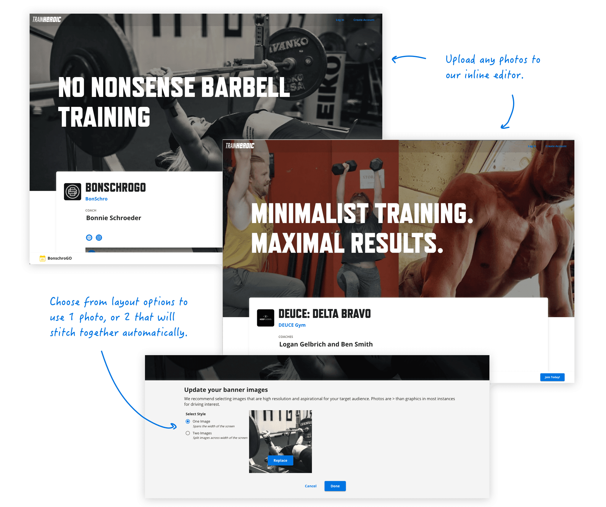
Rather than using one gigantic and tough-to-format “hero” image at the top as a banner, we broke this into two simple 1X1 images you could grab straight off your Instagram. Our 3.0 template magically stitches these images together and layers a filter on top so you don’t have to deal with the Photoshop fuss.
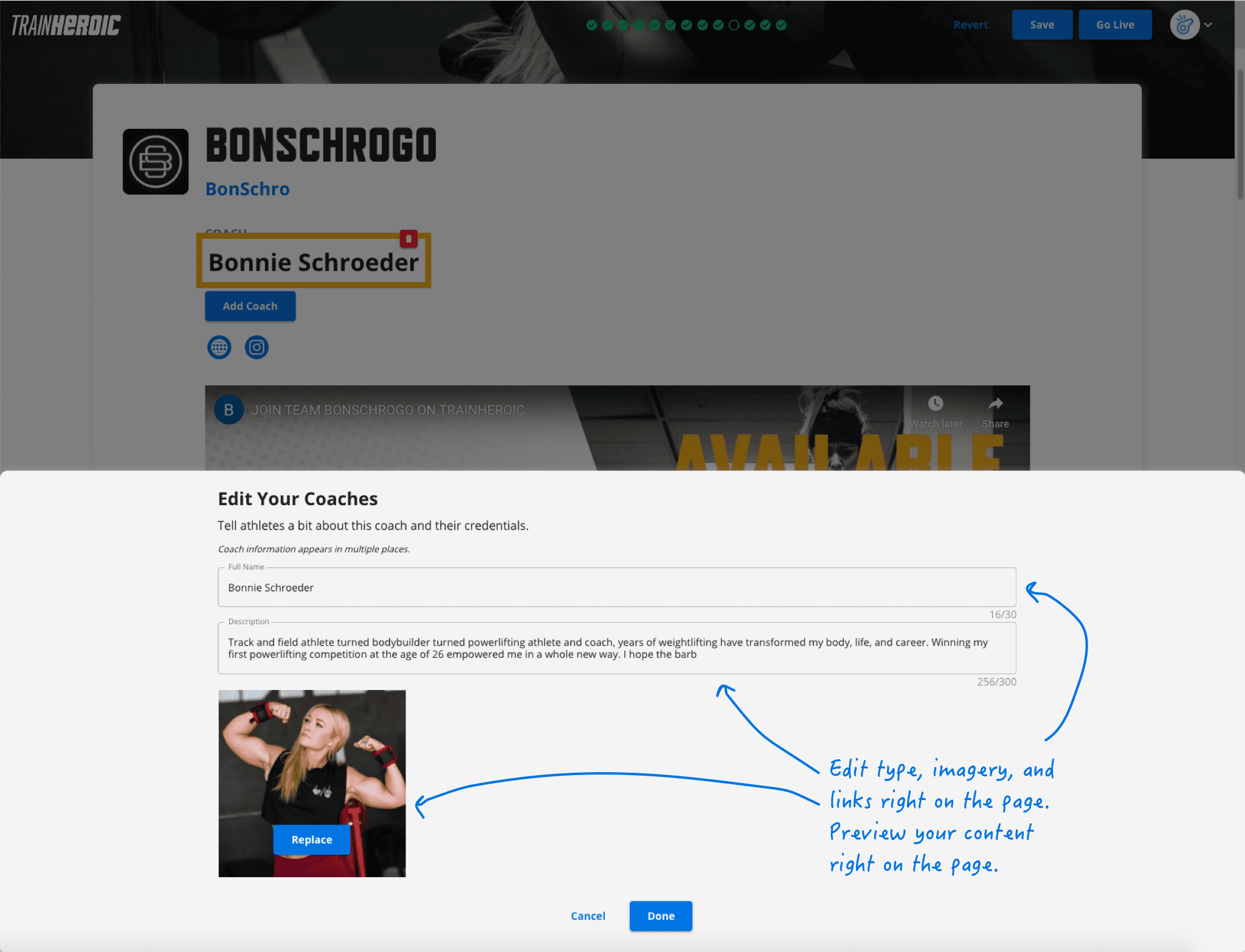
Our page editor is filled with little tool tips and “paint by numbers” helper text to walk you through the basics of building a high-converting page. The in-line editor allows you to build your page while previewing exactly what your audience will see.
Rather than forcing you to monkey around adding checkout buttons throughout, our team’s done the work for you. We injected bright blue buttons at each peak motivational stage in the browsing journey, with a persistent “call to action” floating on the screen as viewers scroll. That way, whenever your buyer is excited, they can take action, check out, and get to training.
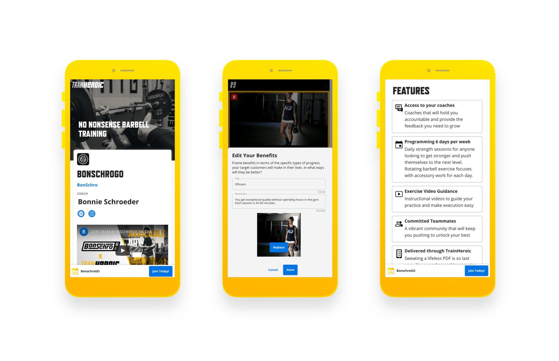
Oh ya, and you can even do all of this page building from the convenience of your mobile device. We’re putting the power of this tool right in your hands.
3. Address the Objections
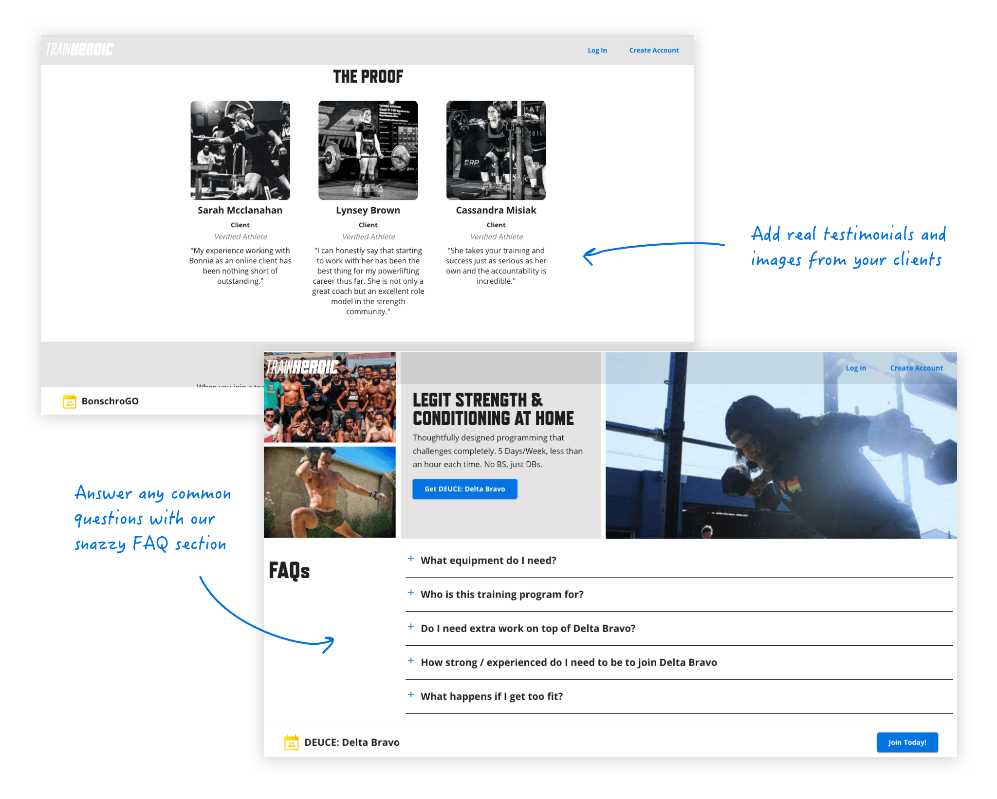
And for the logical pieces of the buying decision, we embedded a structured list of features that use clean iconography to professionally frame your offering. We injected an easy to consume sample week of training to better layout expectations for the training. We sprinkled in a testimonial section to deliver some desired social proof. And we finished it all off by adding customizable FAQs to handle any anxieties and concerns your buyer might have.
The proof
With years of experience building marketing pages, we thought we had something special with this new design, but we wanted hard proof this would drive real outcomes for our sellers.
So before jumping into engineering, our team battle-tested the conceptual design with longtime TrainHeroic Marketplace seller, California Strength. Using their marketing website as a laboratory to vet these principles, we tweaked, tuned, and dialed in the design until we saw spikes in the buy-rate of their traffic.
After a couple weeks of adjustments, we saw a 38% increase in conversion, which in the first month following launch, has helped fuel a 10% increase in online training revenue.
%
Increase in conversion rate
%
Increase in online training sales revenue
Having validated the power of the page design in the wild, we’re now unlocking these optimized templates for all, bringing seller performance to the people.
Today, any coach selling their online training products in the TrainHeroic Marketplace can take advantage of this new template.
And, as we always try to put our customers first, we’re not forcing a transition of existing pages. Once you use the new template, we’ll simply replace your previous page. Until then, no work is required.
However, it’s worth noting that these 3.0 pages will be ranked higher in our Marketplace than the old templates, so we encourage you to jump on this opportunity to crank up your conversions and update your pages whenever possible.
Getting started
If you are an active TrainHeroic coach with Marketplace enabled, you can get to the new PageBuilder 3.0 two ways.
Navigate to your account settings and click the blue button under the marketplace tab.
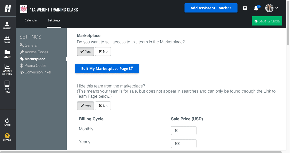
Or, navigate to your current TrainHeroic marketplace sales page while logged into your account, and select the blue button in the nav bar.

P.S. stay tuned for more
Stay tuned for more content in our power seller series that will teach you to position and package like a pro. We’ll take you from concept to your first customer, sharing the techniques that the best online sellers use to maximize the impact of their offerings.
READY TO TRY TRAINHEROIC?
Our powerful platform connects coaches and athletes from across the world. Whether you are a coach or trainer looking to provide a better experience for your clients, or you’re an athlete looking for expert programming, click below to get started.
Want more training content?
More coaches and athletes than ever are reading the TrainHeroic blog, and it’s our mission to support them with the best training & coaching content. If you found this article useful, please take a moment to share it on social media, engage with the author, and link to this article on your own blog or any forums you post on.
Be Your Best,
TrainHeroic Content Team
HEROIC SOCIAL
HEROIC SOCIAL
TRAINING LAB
Access the latest articles, reviews, and case studies from the top strength and conditioning minds in the TH Training Lab


